Roommatcher
The Process
1
1
Research Findings
Based on our research, we found that college students employed several unstructured ways, such as posting online on social media, asking friends, and depending on word-of-mouth, to find roommates. While some were successful in finding compatible roommates, many faced several issues during their lease terms. These issues were mainly associated with roommate compatibility.
We found some services that aided the roommate matching process. However, most of them had several drawbacks. For an example, one service would provide services to apartments and facilitate the roommate matching process after an individual would sign the lease. This was not very helpful because the individual had a smaller user pool to choose from, thereby lowering the probability of finding a compatible roommate.
We recognized the need for a service that makes the roommate matching process simple, easy, and fun. Roommatcher allows users to choose roommates before signing a lease, provides objective methods to assess compatibility, and enables users to connect with potential roommates.
To move forward we this idea, we conducted some user research and came up with two Polished Personas.
Polished Personas
2
Creating personas for our Roommatcher app was a crucial step in understanding the needs and behaviors of potential users. By identifying and detailing specific user archetypes, we are able to gain valuable insights into how the app may be used and what features would be most important to different types of users. They also helped us develop empathy for our users and create a shared understanding of their goals and motivations. By developing detailed personas, we were able to create a more targeted and personalized user experience that meets the needs of our target audience.
Using these Personas, we made a User Journey Map.
Personas

3
User Journey Map
The User Journey Map was a rather impactful assignment for our project. When our team took a moment to sit down and identify what feelings our users could experience while interfacing with our app, we were also able to identify what it is we want our app to accomplish. We also engaged in extensive discussions about ways we could design our app to mitigate the instances of some of the more negative feelings.
The UX Map also forced each of our team members to think about different scenarios our users may be placed in and describe that experience in their own words. This was really powerful for us as a group as it got a lot of different ideas on the table at the same time. It was an excellent tool to get all members on the same page about our product and its use cases.
Ultimately, our finished product is a very polished diagram of a users initial journey with the Roommatcher app. From the initial decision to find roommates to finally finding someone to room with, our UX Map follows one of our model users, Sarah. Our map highlights emotional highs and lows of the user experience and focuses on feelings of anxiety, frustration, and satisfaction. The use of quotes and touchpoint events throughout the map hope to provide the viewer with contextual evidence as to why the users emotions change as they do. To us, the designers, these instances help provide us with areas of intrigue for us to pay extra close special attention to.
Now that we had an enhanced understanding of our user, we moved to drilling down the Design Requirements for the App.
User Journey Map

Design Requirements
4
The purpose of our design requirements document was to clearly identify the functional attributes of our app that we wanted to ensure were included. Using the User Journey Map we clearly defined these requirements and were able to focus our energy on specific parts of the app, rather than wasting energy with cyclical ideation. It was also a great opportunity for our team to hammer out the design of certain features we knew we wanted, but didn't know exactly how we wanted them to look.
Below, you will find a selection of some of our most important design requirements:
The design should allow users to...
-
specify desired roommate preferences
-
swipe left or right on user profiles to indicate their choice
-
be alerted when they have matched with a potential roommate
-
communicate with current matches to evaluate roommate compatibility
-
declare a current match as a future roommate
-
search for additional roommates as a pair or group
To recognise how we wanted to bring these requirements to life, we created some Storyboards individually.
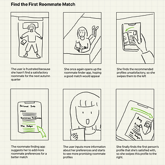
5
Storyboards
We individually created a series of storyboards to identify areas of the user journey that may be confusing or frustrating, and brainstorm ways to improve the user experience. When creating storyboards for a Roommatcher app, it was important for us consider the different stages of the user journey, and the emotions or needs of different personas. By incorporating these elements into the storyboard, we were able to create a more realistic and engaging representation of the user experience, and test different design solutions before implementing them in the app.
Storyboards
Bad Roommate Experience

Installing the App

Finding a Roommate App

Setting up the App

First Roommate Match
Not Picking a Roommate

Finding a Perfect Match
Moving in with Roommate


Information Architecture
6
We aimed to organizing our content and create a clear and intuitive navigation system that allows users to easily find what they are looking for in our Roommatcher app. This involved creating head categories such as accessing the site itself, and subcategories such as "Matches," "Find Roommates," and "Chat," and then arranging them in a hierarchy that prioritizes the most important features. Having a well-designed information architecture would improve the user experience by reducing confusion, increasing engagement, and helping users achieve their goals more efficiently
Information Architecture

7
Low-Fidelity Prototype
After coming to a consensus of the information architecture, we wanted to test our ideas and start to build our low-fidelity prototype in Figma. At this stage of the prototype, we focused on the key interactions and major functionalities of the system more than the visual elements.
Our prototype has three main tabs, "Matches", "Find Roommates", and "Chat", where the "Find Roommates" tab allows a user to see the other users profiles recommended by the system and swipe right or left on them, the "Matches" tab allows a user to see their current matches' profiles and chat with them, and the "Chat" tab allows a user to message with their matches.
Click the prototype below to interact with our lo-fi prototype.
Low-Fidelity Interactive Prototype
Annotated Wireframes
8
Our information architecture had structured the basic hierarchy of the functionalities in Roommatcher, and with our design requirements in mind, we began to create the lo-fi interactive prototype on Figma for the key screens and features. Then we annotated our system by listing the possible interactions for each created screen. We created the annotated wireframes as a documentation for our design system, which allows us to have a clear understanding of the interactions and features at the lo-fi stage.
We identified the three most important pathways for users to achieve and put together the visual interface state transition diagrams that represent the steps one might take to go through each pathway. The three transition diagrams map to the three main tasks we wish the users to easily achieve.
Now that we have our design system along with the low-fidelity interactive prototype, we can move forward to the usability testing phase.
Visual Interface State Transition Diagrams

9
Quick Evaluation Findings
Moving on to the quick evaluation stage, we would like to understand the strength and disadvantages with our lo-fi prototype by conducting usability testing. We hoped to receive feedback and gain insights from the quick evaluation, and integrate those components into our next iteration of prototype, which is the high-fidelity prototype.
To start with our quick evaluation, we first identified three tasks as described below, then each one of us reached out to a participant who was not familiar with our app. We observed their interactions with the prototype, conducted brief post-task interviews, and documented the feedbacks and findings from the usability testing. The evaluation process helped us discover potential flaws, design redundancies, and unclear wordings with our lo-fi prototype, enabling us to improve the functionality and visual design for our hi-fi prototype.
Tasks for Evaluation
Task 1 From Account Creation to Logging out
Description: We asked the user to start with the welcome page and create a profile. After the homepage is shown, we asked them to log out by navigating the "Log out" button on the "Settings" page.
Completion Criteria: This task is complete if the user is able to log out of the app only after successfully creating a profile.
Task 2 From Signing in to Getting the First match
Description: We asked the user to start with the welcome page and sign in to their account. After the homepage is shown, we asked the user to interact with the roommate-finding swiping feature until they find their first match.
Completion Criteria: This task is complete if the user is able to find a match after signing in. They are to match with Emma and are instructed to prioritize finding a match above all else.
Task 3 From Signing in to Chatting with a Match (via the “Matches” page)
Description: We asked the user to start with the welcome page and sign in to their account. We then asked the user to navigate to the "Matches" tab to access a chat with one of their matches.
Completion Criteria: This task is complete if the user is able to first sign into the app. If they are able to then successfully navigate to the matches tab and open a new chat with a match, they will have completed this task.
Findings from Usability Testing
Finding 1: Participants had varied interpretations and opinions about the swiping feature. For example, one participant tried to swipe on the “About me” section while another participant tried to swipe on the arrows.
Solution: The prototype should allow the users to swipe on all elements of the “Find roommates” screen. This will include the “About us”, the image of the potential roommate, and the arrows.
Finding 2: Some participants completely ignored the existence of the thumbs up and down buttons while some tried to interact with them by tapping on them.
Solution: We removed the thumbs-up and -down buttons.
Finding 3: Participants had trouble understanding the designated definition of becoming a match. One participant expressed their confusion and was not sure how to interpret the matching process, specifically, they were not able to identify if swiping right makes them a match or if mutually selected users are paired as a match.
Solution: We added one more screen that provides instructions about how to use the roommate finding swiping feature as well as how the system decides if the users are a match.
High-fidelity Mock-up
10
We applied the solutions to our Quick Evaluation Findings and upgraded our Lo-Fi prototype to a Hi-Fi prototype. We chose a soft pink color with a clean white interface with simple font styles.
This was the last and final step in this long and arduous yet fruitful journey.
High-Fidelity Interactive Prototype
11
Group Reflection
Reflection
We learned that the frustration and anxiety of finding a good roommate are very commonly experienced emotions among people, even if now it's easy to have access to the online roommate-finding apps and websites, and that's why one of the goals for developing Roommatcher is to make the roommate-finding process easier and with less stress. We also realized the potential problem of the app being abused, because it's hard to keep track of if every user is honest with their information and challenging to evaluate if they are respectful to the other users. We tried to address this issue by having a "Report" feature under the settings page, but more rules should be set around the report feature. We also recognize that users might have privacy and safety concerns for inputting their personal information in Roommatcher, and we will need to come up with more logistics of user data usage to address the privacy concerns.
If we were to continue working on this project, the future development of Roommatcher will emphasize more on refining the recommendation logistics and the development of non-major features. For example, in the current iteration of the "Swipe History" function, users are allowed to see the profiles of users they've swiped on, but there aren't any explicit interactions that would allow them to swipe right on any of these profiles.
Through this project, we were able to learn and apply several User-Centered Design concepts. We learned the importance of making ethical and fair design decisions, creative problem solving, and identifying pain points. In addition to that, we learned how to work in a group, practiced critiquing each other's ideas, supporting team members, and making important decisions.
We would like to take this opportunity to thank our instructor Dr. Coppola and our teaching assistant Laura Jo Swartley for all their help and guidance with this project.